Visualizing Tweets During Election Weekend
Posted on Thursday, Dec 10, 2015 in programming
On Sunday (Dec. 06) parliamentary elections were held in Venzuela. I took the opportunity to fetch some data from Twitter's public stream and use graphics to show what was happening in "social media" during that day. To achieve this I relied in the Python programming language.
The Data
I decided to monitor all geolocalized tweets with my home city (Caracas) as origin over a period of five days, two days before the elections, the election day, and two days after it.
To fetch the data, I used the Twython library since I've worked with it before. Therefore, it should be easy to setup a quick script to fetch the data and save it in a text file.
Once the API and OAUTH keys are correctly following Twython's documentation, the next step is to fetch the data originating in certain location, passing it as a parameter to the streaming API. Twitter uses a set of bounding boxes to track the location of a tweet and only geolocated Tweets falling within the requested bounding boxes will be included.
1 2 3 4 5 6 7 8 9 10 11 12 13 14 15 16 17 18 19 20 21 22 | import json, os
from twython import TwythonStreamer
caracas_location = "-67.017225,10.419554,-66.778716,10.52006"
class MyStreamer(TwythonStreamer):
def on_success(self, data):
if data['coordinates'] is not None:
with open('tweets.txt', 'a') as f:
f.write(json.dumps(data))
f.write('\n')
def on_error(self, status_code, data):
with open('errors.txt', 'a') as f:
f.write('error: {0}: {1}'.format(status_code, data))
stream = MyStreamer(os.environ['APP_KEY'], os.environ['APP_SECRET'],
os.environ['OAUTH_TOKEN'], os.environ['OAUTH_TOKEN_SECRET'])
stream.statuses.filter(locations=caracas_location)
|
Since I just wanted to fetch geolocalized tweets, I checked for the existance of the coordinates entity in the Tweet object and only save the tweets with geolocation data (lat/long). After running the script for a few days I have around of ~50,000 tweets to play with.
Visualizing the Data
Where were the tweets located?
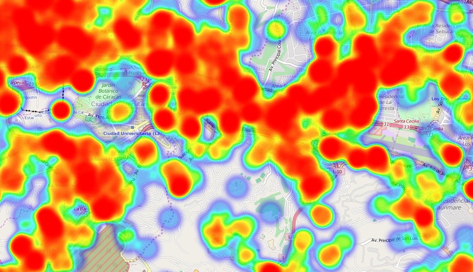
The first that I wanted to do with the data was to see what was the origin of the tweets during that period. I decided to use a heatmap on top of a geographical map of the city. To do it, I used the development version of the Folium library, which implement mapping in Python on top of Leafleat.js and its plugins.

Click here to see an interactive full version of the heatmap (Warning big file!)
The code used to generate the heatmap, once I've read the text file into a list named data is as simple as:
- Creating a map centered in Caracas (10.497084, -66.8854171).
- Add each data point to the map using the add_children method.
- Writing the html file.
1 2 3 4 5 6 7 | import folium
from folium import plugins
# Create a heatmap with the data.
heatmap_map = folium.Map(location=[10.497084, -66.8854171], zoom_start=12)
heatmap_map.add_children(plugins.HeatMap([[t[1], t[0]] for t in [tweet["coordinates"]["coordinates"] for tweet in data]]))
heatmap_map.save("heatmap.html")
|
NOTE: Twitter coordinates are formated as geoJSON that is: longitude first, and then latitude. The code swaps them to add (lat, long) points to the map.
In the heatmap, we can clearly see the parks and protected areas in Caracas with zero activity. The same way, there is a lot less activiy in Caricuao, than in the rest of the city. That would be an expected result in the parks and protected areas, but since Caricuao is a large neighborhood the results are clearly interesting.
How does activity look?
So, there's a heatmap of the location of the tweets, but how can we represent the activity over the five days?
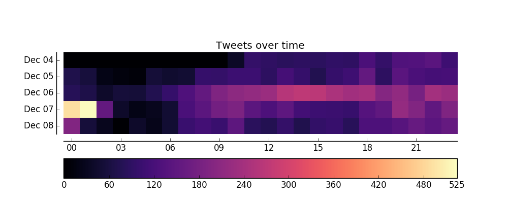
I thought that a calendar type chart, such as the one that shows the contributions activity on Github profiles, was an interesting way to represent the data visually. Grouping the tweets by day and hours in cells, and increasing the intensity of the cell depending on the total amount of tweets during that moment.
To achieve this, I decided to use matplotlib as the plotting library, insted of using a Javascript based library such as D3.js.
1 2 3 4 5 6 7 8 9 10 11 12 13 14 15 16 17 18 19 20 21 22 23 | import matplotlib
import matplotlib.pyplot as plt
from matplotlib.ticker import FuncFormatter, MaxNLocator
import numpy as np
#
# Load the dataset into a nested list with the `Date` and the `hour` data
#
fig, ax = plt.subplots(figsize=(10, 4))
image = np.array(data_array)
cax = ax.imshow(image, cmap=plt.cm.magma, interpolation='nearest')
#
# Add some parameters for the ticks
#
# Add colorbar/legend
cbar = fig.colorbar(cax, orientation='horizontal')
plt.subplots_adjust(wspace=5, hspace=5)
plt.savefig("tweet_frequency_heatmap.png")
|
With some visual adjustments such as adding labels to the ticks, I've got the graphic I wanted.

NOTE: The lack of tweets during the morning of December 4, is due the absence of data in that period.
As expected, after midnight, when most people are sleeping, the amount of tweets is very close to zero in normal days (Dec 04, Dec 05, Dec 08). On the election day, the graph shows above "normal" activity, and we can see the exact moment when the results of the election were announced on national TV. Between 12 a.m and 2 a.m. of Dec. 07 the amount of tweets in Caracas duplicated.
More visualizations coming soon!
Tools
This little project was used to research and learn the basics of the tooling available to represent data visually (graphs, charts, maps, etc.) some of the tools researched were:
You can check the Python wiki for a comprehensive list of libraries and resources for plotting data.